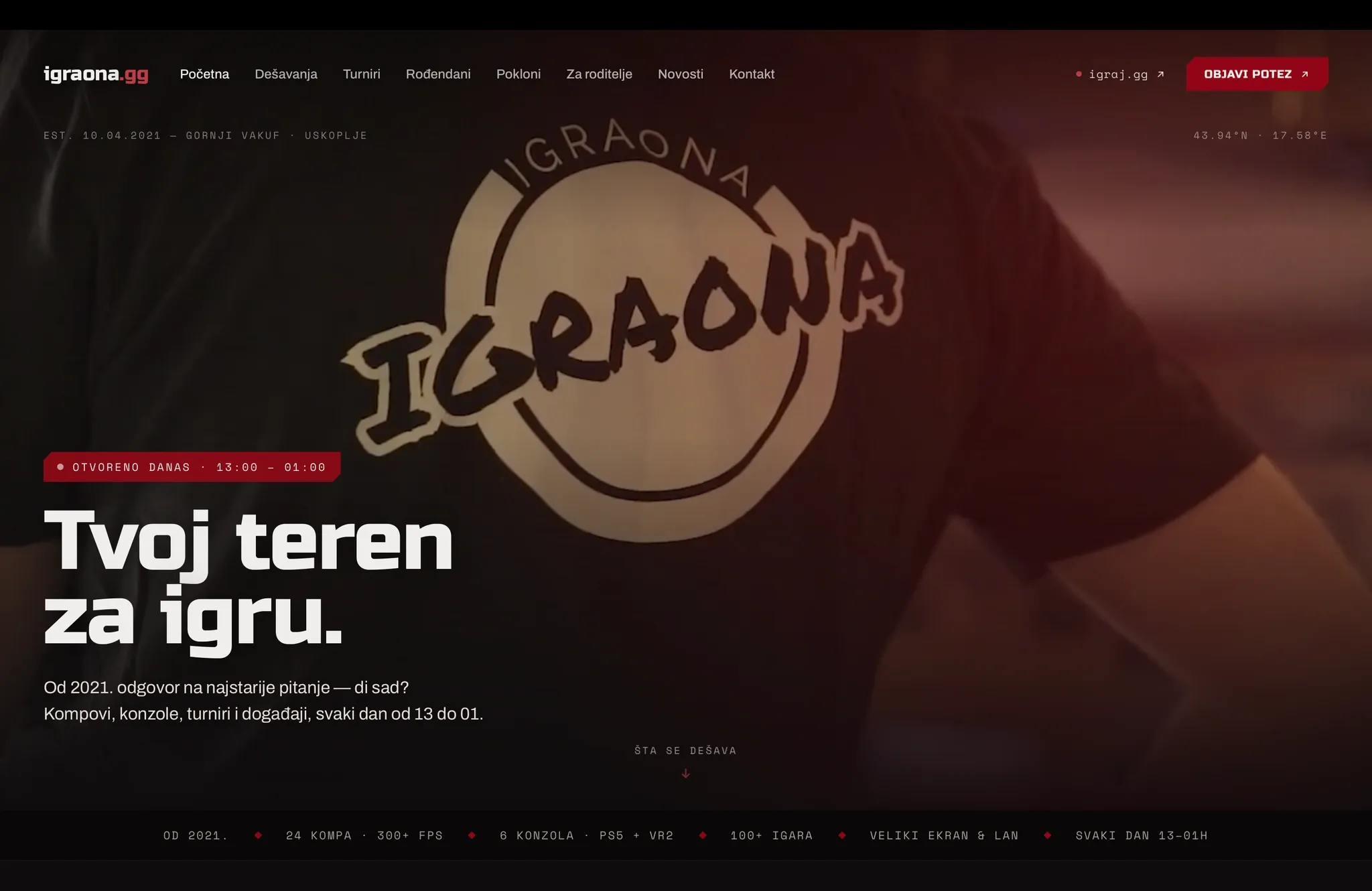
igraona.gg — the website for the physical Igraona venue
01 — CONTEXT
Igraona is an internet café in Gornji Vakuf–Uskoplje.
By the time the client came to us, it had already spent five years becoming much more than a room with gaming computers. There were regulars who had grown up around it, tournaments people returned for, birthdays, friendships, rivalries and the small rituals that accumulate when people keep choosing the same place.
The people who spent time there knew that.
Its website didn't show it.
The client wanted to begin a new chapter for Igraona: bring more people into the community around it, make the place easier for parents to understand, and give its digital presence the same sense of identity that already existed inside the room.
Our job wasn't to invent a new Igraona.
It was to understand the one that was already there and finally make it visible.
02 — FINDING THE STORY
There was an obvious version of this project.
We could redesign an internet café website.
Lead with the computers. Show the consoles. List the games, prices and opening hours. Add photographs of the room, wrap it in a modern gaming aesthetic and make everything feel more current.
It would have been accurate.
It also would have missed almost everything that mattered.
The equipment explains what someone pays for at Igraona. It doesn't explain why the same people come back, why tournaments turn into traditions, why someone remembers playing there years later or why the place means something beyond the hours on the clock.
We didn't need a more sophisticated way to describe an internet café.
We needed to understand this one.
That meant spending time with the client on questions underneath the website. What did Igraona want to preserve? What should young people get from spending time there beyond the gaming time they bought? What should a parent understand when they look at the place from outside? What would make the next five years worth building?
The answers were rarely grand.
A good place to spend time.
A place to hang out properly.
A place where people make memories.
A place parents can walk into and understand.
Eventually, we wrote the mission down:
Give young people a good place to spend their time.
That became the center of the work.
Igraona didn't need to become something other than an internet café. Gaming is fundamental to it.
What mattered was everything that had grown around it.
03 — FIVE YEARS WERE HIDING IN THE ARCHIVE
Knowing Igraona had a story and being able to tell it truthfully were different things.
Early design work used scaffolding.
Plausible tournament entries. Events that gave sections something to contain. Copy that helped us understand how a chronicle might work before we knew exactly what belonged in it.
The page started looking convincing.
That became the problem.
Igraona didn't need a convincing history. It had a real one.
So we stopped filling the design and started going backwards.
Years of posts, tournament announcements, photographs, results and fragments of everyday life had accumulated in Igraona's archive. We worked through them, reconstructed what had happened, checked dates with the client and separated what we knew from what we merely thought we knew.
Some of our assumptions were wrong.
Some of the real stories were better.
And some things couldn't be established confidently enough to publish, so they stayed out.
The process changed the language of the site.
"5+ years" became Est. 10.04.2021.
"Tournaments" became tournaments with dates and a sequence.
"Community" stopped needing to be said so often because the page could show years of people actually doing things together.
The chronicle stopped being decoration and became a record.
At the bottom of it, there was another temptation: fill the next row.
We left it empty.
The next piece of Igraona's history hadn't happened yet.
The website wasn't there to make five years look fuller. It was there to give those five years their due.
04 — DESIGNING THE PLACE, NOT THE CATEGORY
The deeper we went into Igraona, the less interested we became in making it look like a gaming website.
Not because we wanted to move away from gaming.
Because generic gaming aesthetics would have moved us away from Igraona.
The business already had five years of visual identity behind it. Its logo existed. Its red existed. Its typography existed. People already knew them.
We kept them.
The new work was about giving those pieces a system and surrounding them with material that belonged specifically to the place.
Real photography instead of anonymous gamer imagery.
The room instead of equipment glamour.
Tournament footage instead of decorative motion.
Dates, captions and records instead of invented proof.
The brand red could do more by being almost the only loud color than it could surrounded by the usual neon palette.
Even the way the page moved changed. The hero could carry the life of the room through video; the rest could afford to be quieter.
What emerged was less like a campaign and more like a record of a place that happened to still be alive.
The aim was specificity.
The page should feel like it could only belong to this room, in this town, with this history.
05 — BRINGING PARENTS CLOSER
Parents were one part of the new chapter, not the whole of it.
Many of Igraona's regulars are young, so their parents are naturally part of the relationship around the venue.
The easy response would have been reassurance.
Safe. Responsible. Family-friendly. Good for young people.
We avoided all of it.
A business calling itself trustworthy doesn't create trust. And building a polished, separate version of Igraona for parents would have hidden the thing we actually wanted them to understand.
So we started with something simpler:
parents should see the same Igraona their children see.
The people. The room. An ordinary afternoon. The tournaments. The history. The prices. The staff behind the counter.
The website makes that relationship easier to begin.
The same principle also led to a second product: a companion app for parents.
Its job is deliberately narrow.
Give a parent honest, limited visibility into whether Igraona currently considers their child to be there, notify them when that presence begins and ends, and let them understand recent time at the venue.
Not GPS.
Not a remote-control panel.
Not private messages, browsing history or a way to reach into the child's life outside Igraona.
The relationship is established in person, with Igraona staff and the child present. The child isn't expected to carry a tracker or perform a new ritual every time they visit.
Igraona takes on the responsibility.
The website helps parents understand the place.
The app helps them worry less when their child is there.
06 — BUILDING A WEBSITE THAT DOESN'T ROT
Once we had done the work to make the page true, we had to ask what happened after launch.
Igraona doesn't have a webmaster.
Nobody is going to spend Tuesday morning maintaining a content calendar because the website architecture says they should.
That ruled out a surprising amount of conventional web design.
A busy events feed looks great until the first expired event stays on the homepage.
An upcoming calendar becomes a liability the moment somebody forgets it.
A stream of small updates creates another publishing channel for a team that already has one.
We designed for the organization that actually exists.
Past things are dated.
Current things are derived where possible.
Future things only appear when there is something real to announce.
The everyday life of the venue stays on Instagram, where Igraona already records it naturally. The website keeps the things worth carrying forward.
That gave the two channels different jobs.
Instagram shows that Igraona is alive today.
The website shows what kind of place has been alive there for five years.
And it gave us a rule we could use whenever a new idea appeared:
The website can become richer over time, but it should never need to become truer.
07 — WHAT WE BUILT
The work became a small product system around the same idea: make Igraona easier to see, understand and trust without changing what the place already was.
The first part was igraona.gg.
The homepage moves through Igraona rather than presenting a catalogue of machines: the people who spend time there, the rhythms of an ordinary day, tournaments and traditions, celebrations, history, gifting and the practical things someone needs to know before walking through the door.
The second part was the parents' companion app.
Built in Flutter, it extends the parent relationship beyond the website with a deliberately limited promise: presence, notifications and historical time visibility without turning that visibility into surveillance or remote control.
That also required a staff-facing surface for the venue itself: minimal child records, in-person linking and the tools needed to maintain the best honest presence state Igraona can support operationally.
Behind those products was the work that made them coherent.
Mission and positioning. Historical research. Editorial rules. Trust boundaries. An evolved visual system. Responsive design. Engineering that stayed proportional to the business.
- Product strategy — mission, positioning and the relationship between community, parents and the digital experience
- Research & content — five years of archive reconstruction, verification and editorial rules
- Website — responsive Astro experience built around Igraona's existing identity and history
- Parents' app — Flutter companion app for presence, notifications and historical time visibility
- Staff tooling — linking, child records and venue-owned presence management
The result isn't one large platform.
It is a few focused tools, each doing a job the physical place actually needs.
08 — WHERE IT LANDED
The new igraona.gg launched in August 2026, with the parents' companion product following as part of the same new chapter.
It would be easy to describe the result as a new identity for Igraona.
It isn't.
The logo was already there.
The red was already there.
The tournaments were already there.
The regulars were already there.
So were the friendships, the memories, the parents who knew the people behind the counter and the kids who had been choosing the same room for years.
That is what made this project unusual.
Most of the things we wanted the digital products to say were true before we wrote a word or opened an editor.
Our work was to understand them well enough to build from them.
Now a regular can recognize their Igraona in the website.
A parent can understand the place their child keeps asking to visit — and, through the companion app, get a little more peace of mind when they are there.
Someone encountering Igraona for the first time can see something that used to be obvious only after walking through the door.
Igraona was already a community.
The digital experience finally showed it.